The Better Marketing Blog
Better tips, tools, and tactics for the AI era.
Better tips, tools, and tactics for the AI era.
Forget trifold brochures and bloated PDFs. Today’s one-pager is short, sharp, and seriously effective. Whether you’re arming a sales team, nurturing leads, or pitching new partners, a well-designed one-pager distills your story into a single page of strategic impact.
In this guide, we’ll break down how to build a one-pager that looks good and drives real results.
A sales and marketing one-pager is exactly what it sounds like: a single-page document (or two pages, front and back) that explains your product, service, or offer in a quick, compelling way. It can be printed, sent as a PDF, or published as a web page.
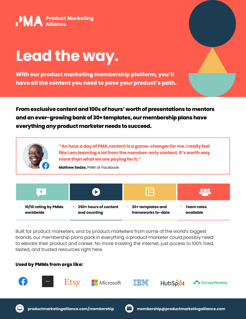 Image Source: Product Marketing Alliance
One-pagers show up everywhere. Here are some of the most common (and effective) places to put them to work:
They’re quick to share, easy to scan, and surprisingly persuasive—no matter where you use them.
The best one-pagers answer three questions fast:
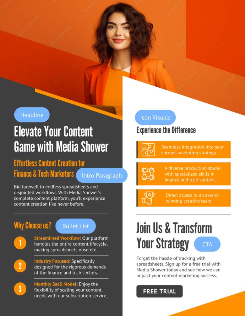
Here’s what to include:
Lead with value. Highlight the outcome, not the product.
Example: “Cut Onboarding Time in Half—Without Hiring More Staff.”
Example:
- Faster onboarding. Get new users up and running in 30 minutes.
- Built-in integrations. Works with your existing CRM, email, and chat tools.
- Real-time analytics. Instantly see what’s working and where to improve.
Stick to one CTA. Don’t clutter with multiple options.
Examples: “Start Your Free Trial” or “Book a 15-Minute Demo.”
With the right tools, building a high-converting one-pager doesn’t have to eat up your week. Start with our one-pager template, then fill in the blanks. Or create your own template specific to your use cases.
This hybrid approach combines the speed of AI with the creativity of real humans—so you get quality and quantity.
One-pagers are the MVPs of sales and marketing collateral.
Some top applications include:
You don’t need to be a designer, but you do need to follow some best practices.
Keep these rules in mind:
Too much detail can distract from your core message. Give each section breathing room and take a “less is more” approach.
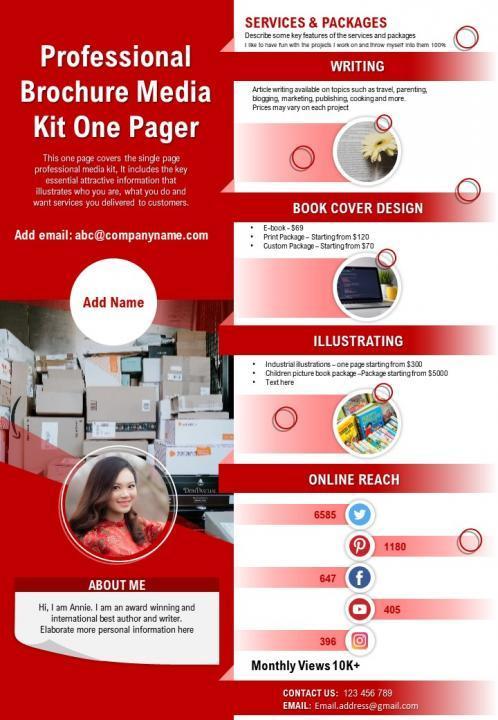 Image Source: SlideTeam
Use one font for headers and one for body text. If you need more contrast for calls-to-action or other essentials, use bold, italics, or different font sizes.
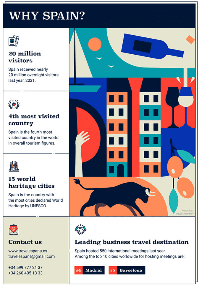
Image Source: appsumo.com
Keep it consistent with your other marketing materials. Every one-pager should reflect your brand so there’s no question who it came from.
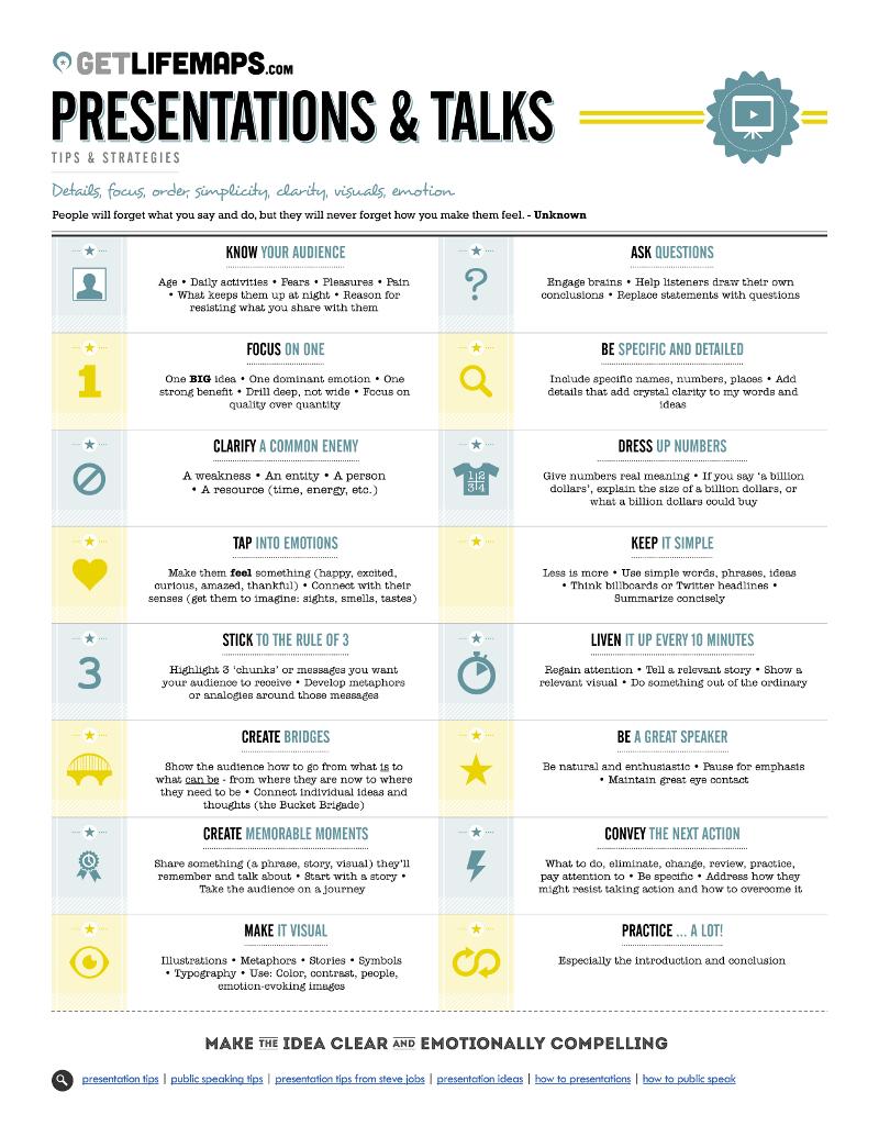
Image Source: Brandongaille
Structure your one-pager to pull the eye to the most important information. Lists, bolded text, and visuals improve scanning and visual flow.
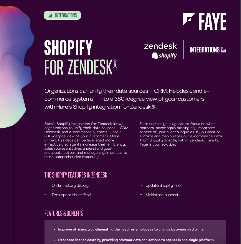
Image Source: Faye Digital
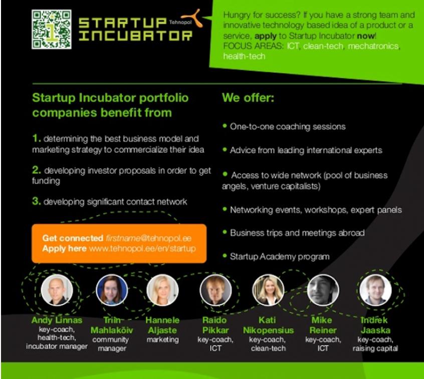
A call-to-action gives your one-pager purpose and direction. Make it pop, and keep it above the fold if possible.
Media Shower’s AI marketing platform helps busy marketing teams create high-performing one-pagers in minutes. Click here for a free trial.
One page—hence the name. Use design to maximize clarity without cramming.
Only if it directly supports the conversion goal. Otherwise, leave it out or link to a pricing page.
Not quite. Flyers are usually promotional; one-pagers are more strategic and information-rich.
Track downloads, clicks, shares, follow-up actions, and closed deals.
Start digital-first. A good layout can be printed later if needed.
Start your free Media Shower trial and get personalized insights on your SEO, competitors, AI visibility, and what to do next.