Using AI to Create Feature Comparison One-Pagers
One of the most effective tools for marketers is comparing your product against a competitor. This guide will show you how to quickly create comparison one-pagers.
AI Prompts for Creating a Comparison One-Pager
Here are prompts to help you polish and perfect your one-pager.
- Refine Descriptions for Unique Selling Points:
“Identify and articulate specific features that set each product apart.”
“Highlight the competitive advantages in language that resonates with our target audience.” - Enhance Clarity in Feature Explanations:
“Simplify technical jargon for a layman’s understanding without sacrificing accuracy.”
“Ensure each feature is explained comprehensively and succinctly.” - Craft a Compelling Introduction:
“Develop an engaging opening that quickly captivates the reader’s attention.”
“Establish the context and importance of the product comparison within the first few sentences.” - Maintain Consistency in Tone:
“Define the desired tone as [formal, playful, etc.] and ensure consistency throughout the one-pager.”
“Review and adjust the language to align with our brand voice.” - Optimize Technical Details for Non-Experts:
“Translate technical specifications into layman-friendly language.”
“Create tooltips or footnotes for complex terms, providing easy access to explanations.” - Address Potential Objections Proactively:
“Anticipate common concerns or objections and address them strategically in the content.”
“Provide succinct rebuttals or solutions to potential hesitations.” - Visualize Key Differentiators:
“Incorporate visual elements such as infographics or charts to illustrate product distinctions.”
“Ensure visual aids align with the overall design and are easy to interpret.” - Introduce a Comparative Analysis Section:
“Devise a section that succinctly compares key features side by side.”
“Use a visual layout that facilitates quick reference and decision-making.” - Evaluate and Adjust Information Flow:
“Assess the current flow of information and make adjustments to improve coherence.”
“Ensure a logical progression that seamlessly guides the reader through the comparison.” - Prompt Further Action in Closing:
“Craft a compelling closing statement encouraging the reader to take the next step.”
“Clearly articulate the desired outcome or decision-making process.”
Examples of Powerful Feature Comparison One-pagers
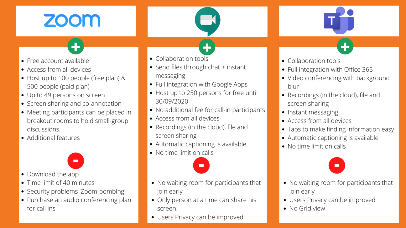
Zoom vs. Google Meet vs. Microsoft Teams
 Image Source: devoteam
This feature comparison one-pager uses a simple table format for quick understanding and is effective at comparing product features for the following reasons:
- Clear and Concise: The table format makes it easy to see the pros and cons of each app at a glance.
- Important Features: The features listed are the ones that are most likely to be important to potential customers, such as price, number of users, and meeting duration.
- Visual Appeal and Simplicity: The use of color and icons makes the table more engaging to look at.
- Objectivity: The table does not favor one app over the other but instead presents the facts neutrally.
- Clearly Highlights USPs: Zoom is highlighted for its free plan and many users, while Google Hangouts is highlighted for its integration with Google Apps.
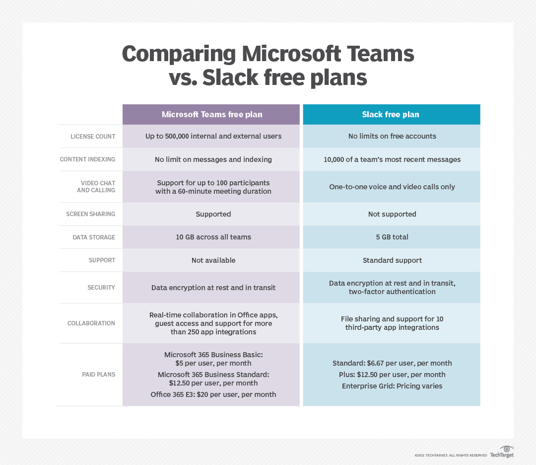
Slack vs. Microsoft Teams Free Plans Comparison
 Image source: TechTarget
This feature comparison one-pager between Microsoft Teams and Slack free plans is effective for various reasons:
- Targeted Information: Instead of listing every feature, it focuses on crucial differentiators relevant to the target audience (likely businesses). This avoids information overload and highlights what truly matters.
- Actionable Comparison: It goes beyond simple checkboxes, using color coding to depict feature availability and limitations visually. This helps users quickly grasp which platform offers the functionality they need.
- Concise Descriptions: Feature descriptions are brief and clear, avoiding technical jargon for easy comprehension. This ensures the information is accessible to a broader audience.
- Strategic Layout: The table is visually balanced, directing users’ attention to key areas like security and user limits. It prioritizes important information for informed decision-making.
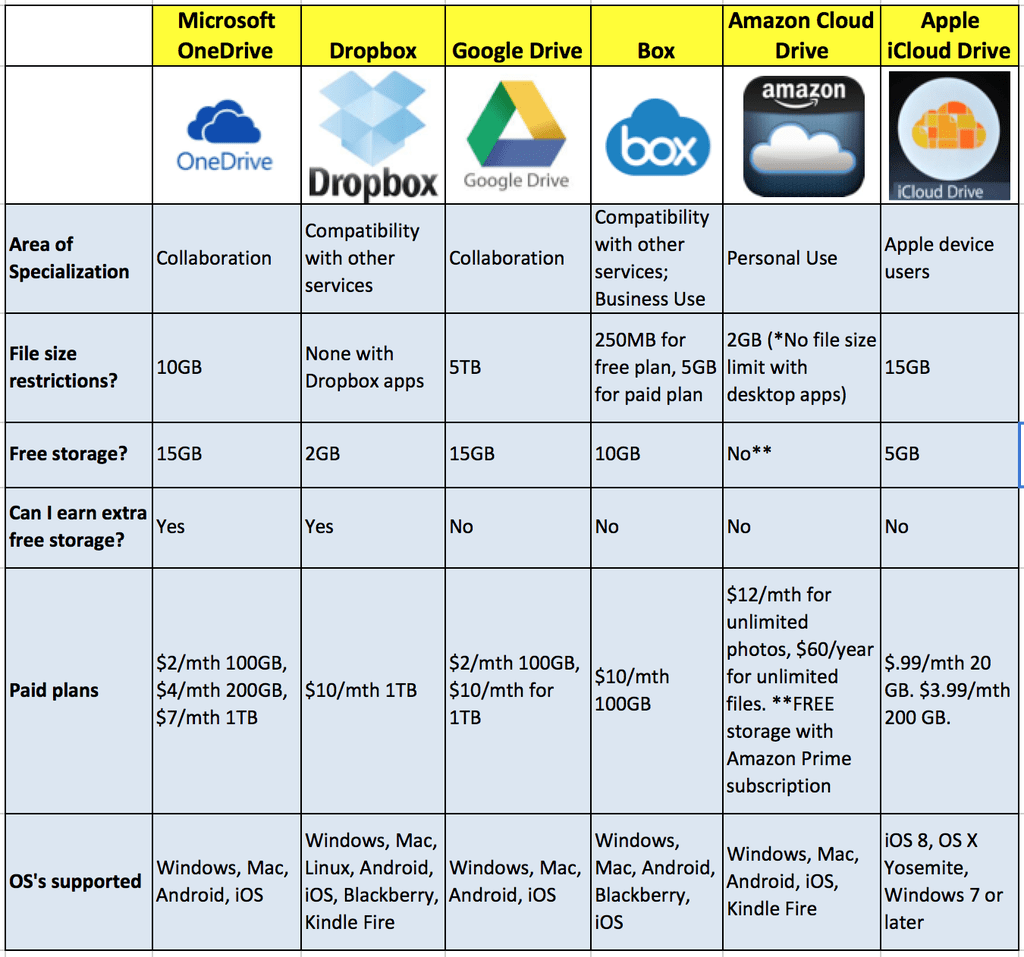
Cloud Storage Platforms Comparison One-Pager
 Image Source: dlvrit
This cloud storage platforms feature comparison one-pager is effective for the following reasons:
- Clarity: The table format is easy to read and understand, with clear labels and icons for each platform. The information is presented concisely, highlighting the most important features without being overwhelming.
- Ease of Comparison: The table makes it easy to compare the different features of each platform side-by-side. This can help people quickly identify the platform that best meets their needs.
- Focus on key features: The table focuses on the key features that are most important to cloud storage users, such as storage space, file size limits, and collaboration tools. This helps people to make an informed decision about which platform is right for them.
Building Your Own Comparison One-Pager with AI
Product Comparison: Samsung Galaxy S21 Vs. iPhone 13 Pro

Best Practices for Creating a Comparison One-Pager
- Clarify Objectives: What is the purpose of your comparison? Drive sales? Increase awareness? Push conversions from interested customers? Depending on your answer, the document might focus more on differentiating features, qualitative benefits, or pain points.
Example: Check our Zapier’s list of tips on how to build effective one-pagers. - Prioritize Key Features: Identify the most impactful features–Conduct user research, select features that address key pain points, differentiate your product, and present them in a clear and concise format, avoiding information overload.
Example: the Hubspot vs. Mailchimp comparison page effectively highlights key features in table format.Optimize Visual - Appeal: Use a solid organization that promotes comparison and understanding, and include visuals that appeal to the reader while highlighting the products or brands compared.
Example: The Cloud Storage Platforms Comparison One-Pager utilizes clear icons and colors for a visually appealing comparison. - Encourage Action: Craft a compelling call to action that is clear, specific, and action-oriented within the flow of the infographic. A clear CTA tells the reader exactly what you want them to do next.
Unlock the potential of one-pager feature checklists with Media Shower’s AI platform and award-winning content creators. Transform your product comparisons into captivating, informative one-pagers that resonate with your audience. Start your free trial now!


