
What if I told you that you could potentially double your leads and sales without getting any more traffic simply by implementing conversion strategies? How would that affect your revenue and your business? It’s true.
Don’t waste money on more traffic if you haven’t optimized the traffic you already have. Focusing on conversions is an effective way to leverage your existing traffic without spending any more money.
Let’s take a look at some conversion best practices you can start using and testing right away:
1. Clear, Concise and Compelling Offers
Your offers should be clear, concise and compelling if you want to convert users.
Clear
What is it you are offering? Make it clear so your users know exactly why they are spending time on your website.
The online marketing agency, Distilled, includes this call to action on its homepage.
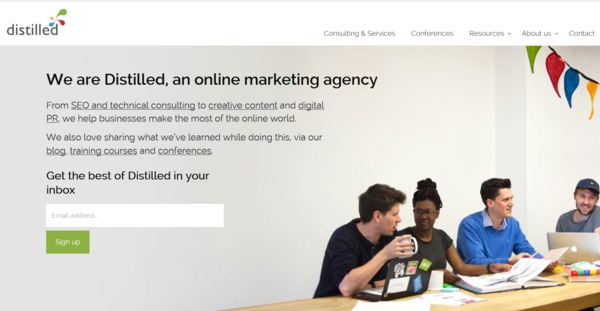
The offer is at the top of the page where it is highly visible and after reading it, users knows exactly what to expect when they opt-in. The copy outlines what Distilled does and provides links if people want to visit more pages before opting in. The call to action allows people to sign up to connect with the company and get access to the valuable content the company distills (pun intended).
Concise
Just because your product offers 15 benefits for users doesn’t mean you should list every one in the copy around your call to action. Focus only on one or two of your top benefits so you don’t clutter your call to action (CTA). This is especially important if you have a more complex sales funnel.
If you have a complex sales process, your only goal with your CTA is to get users to the next step of the process. For example, Hubspot sells software to businesses and offers free trials and demonstrations. But, you don’t see any mention of this on its homepage.
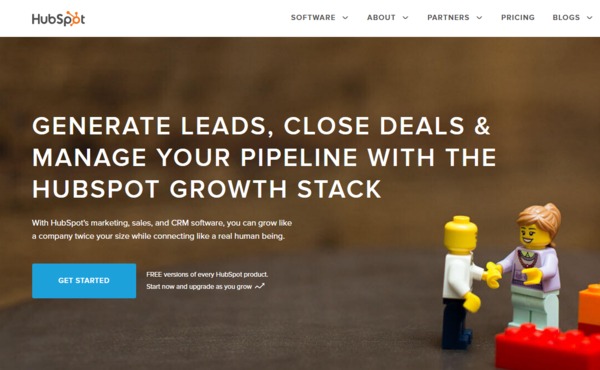
Hubspot does not want to overwhelm people with too much information and pressure to commit at once. The next step for people would be to learn more about the company’s offerings. To that end, Hubspot includes a call to action to “Get Started” which is flanked by a few of its top features (generate leads, close deals, manage pipeline) and benefits (grow like a company twice your size while connecting…).
When your sales process includes several steps, your only goal with each step is to convert users to get to the next step, not close the sale. Avoid offering too much to your prospects all at once and focus on the next step only.
Compelling
Have you stated the benefit clearly? Have you hit a pain point or deep need? Make your offer emotionally compelling.
For example, in Hubspot’s offer copy above, it mentions this benefit:
Grow like a company twice your size while connecting like a real human being.
Mentioning this benefit makes the offer more compelling because it digs deep to hit the user right where he is suffering.
Hubspot could have just mentioned a benefit like “Grow your business.” But instead it mentioned “like a company twice your size” because Hubspot knows business owners struggle with growth in the wake of large businesses with big budgets.
It also mentions “connecting like a real human being” because small businesses have a greater ability to connect with customers due to their small size.
When putting together copy around a call to action, to increase conversions, think beyond the perceived benefits of your products and services and target the deeper need.
For example, if you sell training on how to start and build an ecommerce business, you aren’t just selling an informational course on how to be successful online. You are selling financial and emotional freedom.
Even if you are selling something as simple as ice cream, you are not just selling a great-tasting, sweet treat. You are selling an emotional, sensory experience that translates your customer back to that childlike feeling when life was much simpler and more fun. On a hot day, you are selling a cold, refreshing, satisfying sweet escape from the scorching clenches of a treacherous summer.
2. CTA buttons: Replace the Action with a Benefit
If you have ever studied conversion optimization, you may have read that your call-to-action buttons should tell a user what to do. For example, if you are offering a free eBook or guide, your call-to-action button text should prompt the user to take an action such as “Get It Now” instead of something generic like “Submit.”
This is a good best practice, however, simply telling your users what to do may not be enough to snag the highest conversion rates on your call-to-action buttons.
Consider intertwining a benefit in with your CTA text. First, consider the benefit the user will receive when he clicks on the CTA. Let’s say you are offering a free eBook on how to build a profitable blog. Instead of using boring text such as “Download Now,” try something that reiterates the benefit in the CTA like “Get My Free eBook.” This reinforces that subscribers are receiving an eBook, for free. Or, try something more specific like this, “Get My Free Blogging eBook.”
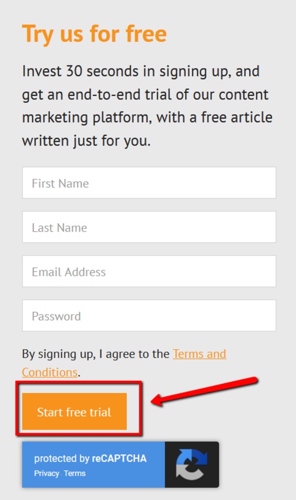
When you sign up for our 30-day free trial here at Media Shower, our button text is “Start free trial.”
We do this so you are fully aware that when you click that button and give us your information, there is no commitment required. You are reminded that you are receiving a free trial and you are assured that when you click that button, that is exactly what you will receive. Get a little creative with your CTAs and don’t leave any unanswered questions for your users.
3. CTA buttons: Tone Down the Commitment
Have you ever seen the infamous “Buy Now” call to action? Though it promotes action, it may lower your conversions.
Using a phrase like “Buy Now” may be too much of a commitment for users and as a result, they may psychologically resist it. If your button text infers that a user will have to spend more money and time after they click, it could deter them.
Orbit Media ran a test on two CTAs and found that the less commitment-centric call to action received 124% more clicks:
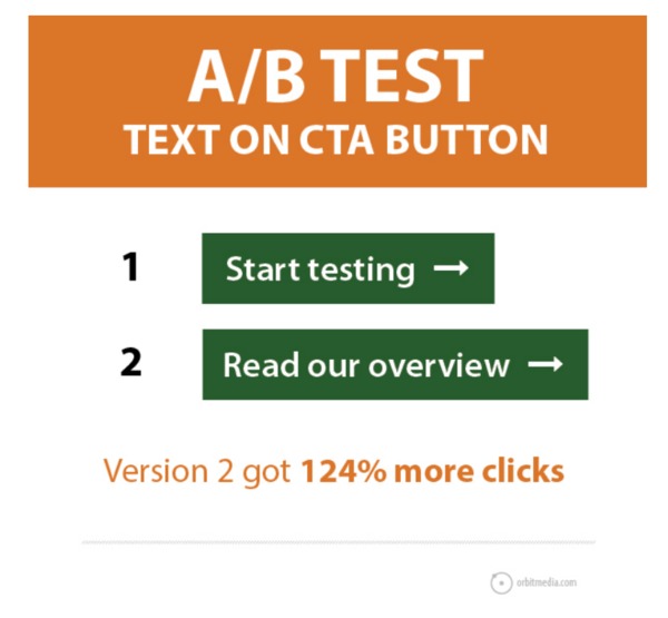
“Start testing” implied that there was “work” ahead and an immediate commitment; however, “Read our overview” was perceived as requiring less commitment.
4. Create Urgency without Being “In Your Face”
You may hear marketers tout the benefits of creating urgency with their calls to action and how beneficial it can be… but not when it wreaks like an infomercial.
This could be you UNLESS you buy our handy-dandy, super-duper carving knife 3000.
Urgency is a strong motivator because people do not want to miss out on good deals. But, too much of a good thing can derail the conversion.
If you are running a limited-time promotion or sale, use language that stresses the urgency without coming off like a sleazy salesman. Nobody likes walking into a car dealership during a month-end sale when the dealerships are trying to make their monthly quotas. Don’t make your users feel like they walked into a high-pressure situation.
When using urgency to increase conversions, add the time limit to the conversion, without laying it on too strong.
Here are some examples:
Before
Get 20% off
After (Good)
Get 20% off until Tuesday at 9pm
Don’t Do This
Get 20% Off. Act Now Or Lose Out!!
Before
Access it now
After (Good)
Access it now for a limited time only
Don’t Do This
Access it now for a limited time. Don’t Wait! Call Now!
5. Establish Credibility
Worked with any prominent companies? Have any testimonials or reviews?
The unbiased words and proof of others can boost your credibility and lead to higher conversions. Credibility features can add proof to your website and landing pages that your products and services are worth a look.
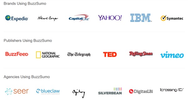
On its homepage, Buzzsumo prominently displays the logos of well-known companies that use its tool.
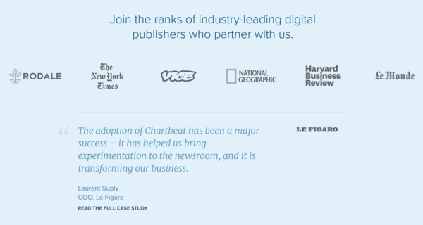
Chartbeat also lists prominent clients as well as a testimonial from one of its case studies:
Haven’t worked with any big-time clients just yet? No problem. Include the logos and testimonies of whomever you have worked with. Even if your website visitors do not know the brands you are mentioning, you will still add some credibility to your brand and increase conversions by mentioning them.
Tip: Skip the over-the-top reviews for the more realistic ones. A review that touts how amazingly great you are may look contrived. Reviews that mention the benefits of your product or service and how they have helped customers may perform the best.
So, go ahead and add your clients and reviews to your website to establish trust and credibility.
Not so fast…
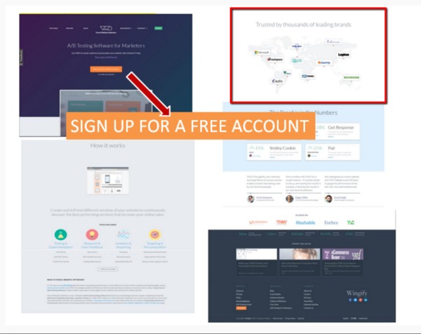
Behave published the results of a study in which it removed the client mentions and testimonials from an offer page and conversions increased by 16.34%. Huh?
The first version included customer logos as well as other brand-boosting elements such as testimonials and video tutorials. You can see the brand’s clients outlined in the red box and the call to action was located on the top of the page (orange button).
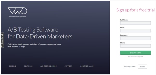
The second version, the winner, was a clear, concise form with minimal copy and no credibility.
Credibility may not always be the right strategy depending on your offer page. According to Behave, the sparser page won because it has less visual clutter and the call to action form was clear and obvious. Remember how we talked about the importance of clear CTAs in checklist item #1? Clarity trumps credibility in this case. The extra visual information on the first version took attention away from the main call to action.
Should you add credibility features to your website? Yes, and they will help to increase conversions since trust is an important factor. But, when you are working with a landing page that has one clear message, don’t crowd out your calls to action with too much information, even if that information is valuable. Even better, test both versions to see which one performs the best. Your audience will always give you the right answer.
6. Know Your Audience
You can dress up your website and landing pages as much as you like, but if your target is not interested in what you are offering, you won’t convert at a high rate.
What content does your target deeply desire?
What are their burning questions?
What solutions are they looking for?
What do they really care about?
What do they not care about?
What language do they use?
What does their daily lives look like?
Do you know the answers to any of these questions? If not, you may have a little research to do.
Relevancy is key when it comes to conversions. The more intimately you know your target, the more it will be evident in every campaign you run and your website and offerings will connect to your prospects at a deeper level.
How do you learn more about your potential customers? Here are a few ideas:
- Get outside – Talk to your ideal customers one-on one and ask them these questions directly. Go where they hang out and feel what it is like to be inside their shoes.
- Monitor their conversations – Review what they talk about on social sites and Q & A sites like Quora and Yahoo Answers.
- Run surveys – If you already have customers, send them a survey and ask them questions about your product and what they liked, didn’t like and what they would improve.
- Ask your team – Ask the people who interface with your potential customers such as the customer service or sales team, what questions or concerns people have.
Knowing this information provides the foundation for your conversion campaigns or essentially any marketing strategy you execute.
7. Test, Test and Test Some More
I may have given you some good conversion strategies to try but please do not trust me 100%. Seriously, I am okay with it.
Your audience is the only one you can trust. And the way you find out what makes them convert is to test.
Year ago, marketers were urging people to use green call-to-action buttons instead of red because consumers naturally think green means “go” and red means “stop.” But, there have been numerous studies disproving this since, including this one for Hubspot where the red button outperformed the green one.
Does that mean that red call-to-action buttons perform better than green ones? Not at all. There are multiple variables that go into why certain colors outperform others. In the Hubspot example, there was a lot of green on the page already so the button didn’t stand out as much. Maybe your audience responds to a different color because of psychological reasons. With so many variables to consider, use these conversion best practices as guides, but test them and other variations for best results.
8. Conversion Rates: Know Your Stuff
Where should your conversion rates be? Are you performing better or worse than industry averages? Are your conversion rates good or bad?
If you don’t know what conversion rates you are striving to achieve, your website may never reach its true potential, since you have no benchmarks to iterate against. Don’t run your conversion rate campaigns blindly. To help you, we created a Conversion Optimization Benchmark Report that lists the conversion rates your competitors are getting for strategies such as lead-generating landing pages, Google Adwords and more.
Did we mention it’s totally FREE? The only thing that stands between you and a mega-blast of marketing knowledge is some basic info:
