Quick Guide to Landing Pages (+ Best Practices and Examples)
TL;DR: In this guide, we’ll reveal the best practices in 2024 for creating landing pages that boost site rankings, traffic, and conversions – and how you can leverage landing page data to achieve business goals. (With examples!)
So what?This is everything we’ve learned from building B2B landing pages, updated for 2024. Learn best practices, see real-life examples, and get all the tips and tricks we’ve learned from designing landing pages for our 500+ clients.
Best of all, our free Landing Page Generator tool will help you create your own landing pages, instantly and free.
How to Use our Landing Page Generator
Just answer a few questions about your company or product, and our AI tool will draft a landing page just for you. The more information you put into it, the better the landing page you’ll get out of it!
Powered by Media Shower AI
What We’ve Learned From 500+ Client Landing Pages
Landing pages are crucial to a successful digital marketing strategy because they are your primary way to turn website visitors into prospects. Using our proven design layouts, clear and compelling calls to action, and search engine optimization will ensure your landing pages become gateways to company growth – and make you the marketing manager that everyone loves.
Unlike regular pages on a website, landing pages–where a visitor “lands” after clicking on a link in an email or ad–have the power to create real sales leads.
Successful B2B landing pages get web users to make a single desired move, be it signing up for a newsletter, filling out a form, or making a purchase. This is the call to action, and it’s the singular focus of any landing page.
By removing distractions, landing pages focus visitors on one message, boosting chances of conversion. To make a great landing page, decide on the single action you want users to take. For example:
- Downloading an eBook
- Contacting a sales representative
- Interacting with a chatbot
- Booking a free demo
- Requesting a quote
How Do Landing Pages Work?
The typical use of a landing page is as a target for social media or search engine marketing campaigns. The mission of the landing page is to convert page visitors into customers or leads through the promise of some sort of value (a high-value downloadable PDF, a product demo, etc.).
A good landing page’s primary design focuses on conversion first (gathering an email, phone number, or other user data) and providing information second. The information that is provided on your page is typically minimal, with just enough to entice the reader to engage.
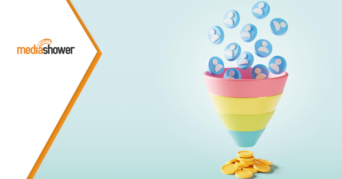
If there is a bottom of the content funnel, it is often the landing page. They are so effective at converting sales leads that 56% of paid search clicks will go to a landing page rather than a homepage.
Creating high-converting landing pages requires a multi-pronged approach that touches on several aspects of the user experience:
Call to Action: Drive Customer Behavior
You need a compelling CTA so visitors will purchase or sign up for a service. Calls to action must pop for the reader, standing along while drawing their attention to the action you want them to take (typically filling out a form or clicking a button).
Take Wix. Their unique branding style and singular focus place their CTA front and center, above the fold. The visitor can read further down the page, but not before moving entirely past this CTA.
 Click to view the Wix landing page
Design: Draw Customers In and Stay Out of the Way
Your landing page design should be clean and intuitive, guiding visitors toward that CTA with as few distractions as possible. Persuasive wording and pleasant, attention-grabbing visuals can make your brand appear more trustworthy.
Landing pages are not the place for long-winded descriptions of your products or services. (Save that for the website.) You want an economy of words, with the bare minimum needed to communicate your value proposition.
Best-performing landing pages focus on the CTA at the top of the page, with several layers of visuals and text further down as the user scrolls. Depending on the length, you may include a CTA at the top and the bottom, catching users’ attention if they decide to actually read the information provided.
Content: Say Only What Needs to Be Said
Landing page content is a contentious (is that a pun?) topic. Typically, landing pages don’t rely on content by volume. Killer headlines and CTAs rule the day. Remember: the landing page’s job is to convert, as quickly as possible.
However, depending on your offer and your CTA, you may find that adding content below a top-fold CTA, especially content focused on customer stories and business proofs, effectively hooks readers.
Let’s look at this landing page for Business-Software.com. For this landing page offering a downloadable report, they provide a top-page CTA that immediately leverages customer feedback, testimonials, and partnership logos. This is a simple design and layout that you can leverage for your own landers.
 Click to view the Business-Software landing page
Using A/B tests and experimenting with different headline designs and word placement will help you determine what resonates best with your audiences and stick to it.
Audience targeting for these landing pages tends to be more specific than the targeting for SEO landing pages. Why? Paid-advertisement pages are tailored to the interests of those who clicked on a targeted ad, and their purpose is to max out conversion rates and deliver a clear return on investment for the ad spend.
Analytics: Gleaning Insights from Your Landing Pages
By evaluating the performance data of your landing pages, you can better understand how users interact with the page, then locate and fix problem areas.
As for measuring the efficacy of your landing page, key performance indicators and traffic measurements can tell you a lot. You’ll want to track::
- Average Engagement Time, or how long readers spend on the landing page (which you can get from Google Analytics 4). Hubspot says the average time spent on a page across industries is 54 seconds.
- Click-Through Rate (CTR), or how many readers clicked an advertisement or link to arrive on the landing page. (You can track this through your ad network, or by using custom link trackers.)
- Conversion Rate, or how many readers land on the site and then take specific actions like clicking a button, providing information through a form, etc. (You can also track this through GA4, by setting up custom conversions.)
You can gauge the efficacy of your landing page and make data-based improvements to get better results.
Examples of Effective Landing Pages

Slack
The main landing page of work-productivity and communication platform Slack illustrates the effectiveness of simplicity. It immediately communicates what Slack does and can help them (“Made for people. Built for productivity.”). Its call to action is centrally placed and gives users two options: the page’s copy is concise and compelling, and the accompanying visuals show potential customers the Slack interface. Hence, they get to see the product before they sign on.
 Click to view the Slack landing page.
Note that Slack’s Talk to Sales page is a more traditional landing page, with a short form, a clear call to action, and a few proof points of why a prospective customer would want to talk to sales (not usually high on anyone’s list).
Toast
Restaurant point-of-sale and management platform Toast’s unique value proposition (“Built for restaurants. Built for you.”) is front and center on its home page – and its landing page repeats that message.
 Click to view the Toast landing page
The “Get a Demo” box on the right stays in place, even while the user scrolls down the page, ensuring that big, bold CTA is always front and center.
Netflix
For Netflix, subscriptions are everything. Their homepage is designed more like a landing page, with a form up front that makes it easy to start a membership, surrounded by images of the shows and movies exclusive to this platform.
 Click to view the Netflix homepage
Directly below this form is a plan pricing banner that shows how inexpensive it is to get started. Of course, this is their lowest-priced tier, but it still serves as an enticement to get started.
Lyft
This landing page – designed to sign up new drivers – starts with an image of a driver looking happy and free. Along with the immediate presence of a sign-up form, the headline “Make Every Day Payday” is a powerful incentivization.
 Click to view the Lyft landing page
It also makes the initial interaction simple–with just a phone number, you can get started with Lyft. This means low barriers to entry and high conversions for Lyft.
Partner with Media Shower for Landing Page Planning and Development
Landing pages are a foundational part of marketing. Their targeted messaging and no-nonsense approach to conversions make them a must-have for modern marketers. Through the examples we’ve covered here, we’ve seen how well-designed, well-written landing pages can convert visitors into customers.
But simple is not easy: landing pages must be well-planned and well-designed because they are laser-targeted to conversions (rather than “wider net” content like blogs and social media).
At Media Shower, we’ve helped over 500+ companies create high-performing content – and we can help your company, too. Click here to sign up for our platform and start your landing page project today.