_600x.jpg)
As explained in our recent guide on the subject, native advertising is a form of paid advertising where the ad experience follows the natural form and function of the user experience in which it is placed. Native ads, when done right, blend in seamlessly with the content around them.
When done wrong, however … well, let’s just say it isn’t pretty. There are a few common mistakes brands make with their native ads that change the user experience from happy to horrible. The good news is that these mistakes can be avoided with just a little effort. Here’s a look at what can go wrong and how to fix it.
Mistake Number One: Failure to Match Your Content with the Audience You Are Targeting
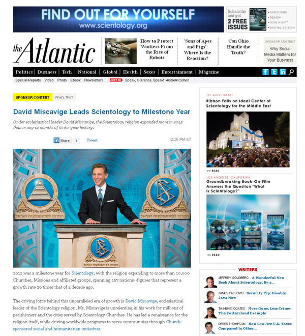
Admittedly, this is a blunder in any type of marketing. However, in native advertising, this error creates a significant backlash from your audience. For instance, take a look at this infamous attempt at native advertising from the pages of The Atlantic.

This is widely accepted as one of the worst examples of native advertising ever. While it is clearly marked as sponsored content, it stands out like a sore thumb for readers of The Atlantic, who generally would not be considered the right demographic to enjoy a pitch for Scientology. Though The Atlantic was quick to take down the ad when readers complained, the damage was done because … you know … we’re still talking about it.
How to Avoid It: Fortunately, you do not have to suffer a similar fate. You can avoid this blunder by ensuring that you align your brand message contextually with the content on the site on which your ad will be placed. Think carefully about the audience for the publisher site. Will your content be welcomed by that audience? If so, you are good to go.
Mistake Number Two: Lack of Transparency
It is true that the whole concept behind native advertising is to blend in smoothly with surrounding content. This does not mean, however, that you should hide the fact that your audience is looking at sponsored content.
There are at least two bad outcomes that can arise from failure to disclose to your audience that they are looking at sponsored content. First, the Federal Trade Commission takes a dim view of anything it considers deceptive ad practices. Moz.com’s “A Checklist for Native Advertising: How to Comply with the FTC’s New Rules” sums it up this way:
“From the FTC’s perspective, the watchword is transparency. An advertisement or promotional message shouldn’t suggest or imply to consumers that it’s anything other than an ad.”
Second, your audience also takes a dim view of anything considered as trickery. If you lose the trust of your audience, your ad is worse than useless. Not only has it not helped your brand, but it has hurt it.
How to Avoid It: Make liberal use of disclosures in your ad. “Sponsored Content,” “Ad,” and “Promoted by” are all acceptable disclosures that clue your audience in to the nature of your ad. The FTC guidelines can help you figure out how best to include disclosures with your native ads.
Mistake Number Three: Too Much Disclosure
There is no getting around the fact that you need to provide disclosures on your ads. However, you can go a bit too far with it. Too much disclosure negates the whole concept behind native advertising. Why? Simply put, native advertising is designed to provide a seamless user experience. Too much disclosure turns a native ad into a disruptive ad.
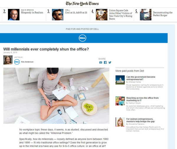
Take a look at this Dell native ad from the New York Times for an example of how not to use disclosures:

True, no one can assert that Dell failed to disclose that New York Times readers were looking at sponsored content. There’s the blue highlighted “Paid for and Posted by Dell” and the Dell logo sprinkled all over the ad. But, be honest. How likely would you have been to actually read this content as you browsed the New York Times?
How to Avoid It: Exercise balance and restraint when including your disclosures. The aim is to make it clear to your viewers that they are looking at an ad without actually beating them over the head with that fact. Take a look at this good example of a New York Times Netflix posted ad that gets the disclosure just right:

Mistake Number Four: Failure to Match the Ad to the Publisher’s Site
If your native ad just does not look like the content around it, it’s a fail. NavigatingNative.com makes this observation: “The important element of native advertising is that it is in fact, native to its environment. That means making sure the ad matches the publisher site down to all the minute details including font, shape, and function of the site. If you fail to do so, you’ll just have an ad that stands out for the wrong reasons.”
How to Avoid It: Take time to mirror the look and feel of the publisher site where your ad will be placed. Pay attention to all the details, including image quality, shape, fonts, and colors used. Remember that the goal is to blend in with the surrounding content, providing viewers with a smooth experience.
Mistake Number Five: Failure to Follow Through with Great Content
A great native ad that leads the viewer to a less than great landing page is nothing more than pretty window dressing. That is a waste of time, energy, effort, and money.
How to Avoid It: Follow through by ensuring that your ad leads viewers to a landing page that is specifically designed to help them on their pathway to conversion. Ideally, your landing page should continue the theme of your ad, rewarding the viewer for clicking through by providing added value in the form of relevant, engaging content.

If you can see the mistakes, you can avoid them.
The Bottom Line
Native ads can yield great results if done properly. Avoid common native ad mistakes by: knowing your target audience, clearly disclosing that your ad is an ad without going overboard, matching your ad’s look and feel with the publisher’s site, and crafting well-designed landing pages with stellar content to follow through with your native ads.
Need some help with that stellar content? We’ve got your back. Request a free content marketing assessment today to get started!