TLDR: How do you create a B2B landing page that gets results? Follow these best practices–including the right length, text, format, and visuals. We lay it all out in this article – with copy-and-paste examples.
So what? Here’s a detailed list of best practices to follow if you’re looking to craft an effective landing page for your business.
Introduction
Landing pages are pivotal in digital B2B marketing. Effective landing pages are short, snappy, and drive users to a specific course of action (clicking a button, providing an email, and so on). The question, however, is how to make an effective landing page in the first place.
In many ways, creating the right landing page is part science, part art, and part marketing acumen. In addition to balancing brevity and clarity, an ideal landing page design features engaging content, a persuasive value proposition, and user-friendly forms.
This article will cover these aspects of landing pages and provide examples that demonstrate how they look in the wild.
What’s the Ideal Landing Page Length?
While it would be impossible to give a precise word count for a B2B landing page guaranteed to result in conversions, there is an approximate ideal size for an effective landing page. Aim for around 300 to 500 words – enough to convey the importance of your offer, while keeping content concise to hold people’s attention.
- Short Landing Pages (around 300 words): Short landing pages–often called “above the fold”–catch the eye quickly and are suitable for simpler offerings or audiences already familiar with your product or service. These should focus on captivating headlines, compelling calls to action, and information critical to making immediate moves.
- Long Landing Pages (no more than 500 words): on the other hand, longer landing pages are better for more complex offers or instances where visitors require more information to decide. These pages can use a structured layout with a strong headline, an engaging introduction, detailed product or service advantages, social proof (such as testimonials or case studies), and a clear CTA.
Because there’s more of it, content should be easily skimmable, using headings, bullet points, and visuals to break up walls of text and maintain visitor interest.
Desktop vs. Mobile Landing Pages
Design your landing page for both desktop and mobile devices – and test it on both!
The majority–about 68%–of web visits are mobile as of May 2023, according to Oberlo. This calls for a “responsive” design, which changes to accommodate different displays, devices, and screen resolutions without sacrificing usability.
For mobile users, this means adjusting the size and orientation of page elements to fit into a mobile browsing experience without losing the craft that went into building an effective page.
- For shorter pages, this means ensuring all crucial elements are visible without scrolling. The designer might, for example, define a vertical headline and button layout for a hero banner that places the lead CTA front-and-center on a mobile screen.
- For longer pages, this would mean prioritizing a smooth scrolling experience and keeping key information accessible throughout. Mobile-friendly forms and content sections, clear CTAs, and concise copy are all key to maintaining visitor engagement and promoting conversions on mobile devices.
Remember to keep user experience and engagement in mind during landing page design, regardless of page length. This will help assure a seamless journey for all page visitors.

The Right Stuff: Designing a Landing Page That Works
The “right stuff” for a landing page includes content, art, user experience, and more. Here are the components to consider:
The Right Headline
Create a headline that conveys the benefits offered by your product or service. In addition to targeting keywords for search engine optimization, the headline should succinctly address a known pain point and provide your audience with an attractive solution.
(If your visitors are coming from paid search, try to match the headline with the search phrase, so the user instantly feels the connection between the ad they clicked and where they landed.)
Positive Imagery
Carefully chosen imagery that resonates with your audience will enhance the look and feel of your landing page, optimize for search engines and reinforce your message. Try to include positive imagery, like smiling people using your product. (You also can’t go wrong with babies or puppies.)
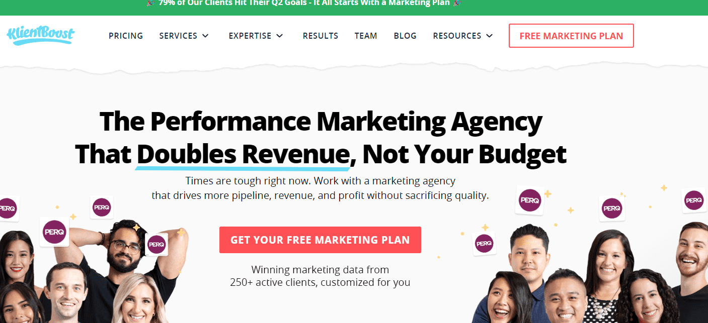
Take the example of KlientBoost. Their lead headline is big, bold, and speaks to a massive pain point–finding a marketing company that boosts revenue and not costs. This speaks to ROI and results-driven engagement.
Persuasive, Punchy Text
Keep your paragraphs short and scannable, with bullet points and subheaders to break up the information. This is not the place for a wall of words!
Use concise, compelling wording that highlights the main features and advantages of your offering. Remember to focus on how it meets users’ needs and solves problems.
Pinnacle Wealth Management’s PPC landing page seems a dense asset… but they wear it well. The block of text on the left provides short, digestible information for the reader that doesn’t distract from the form on the right or the phone number that’s prominent in the upper-right corner of the page.
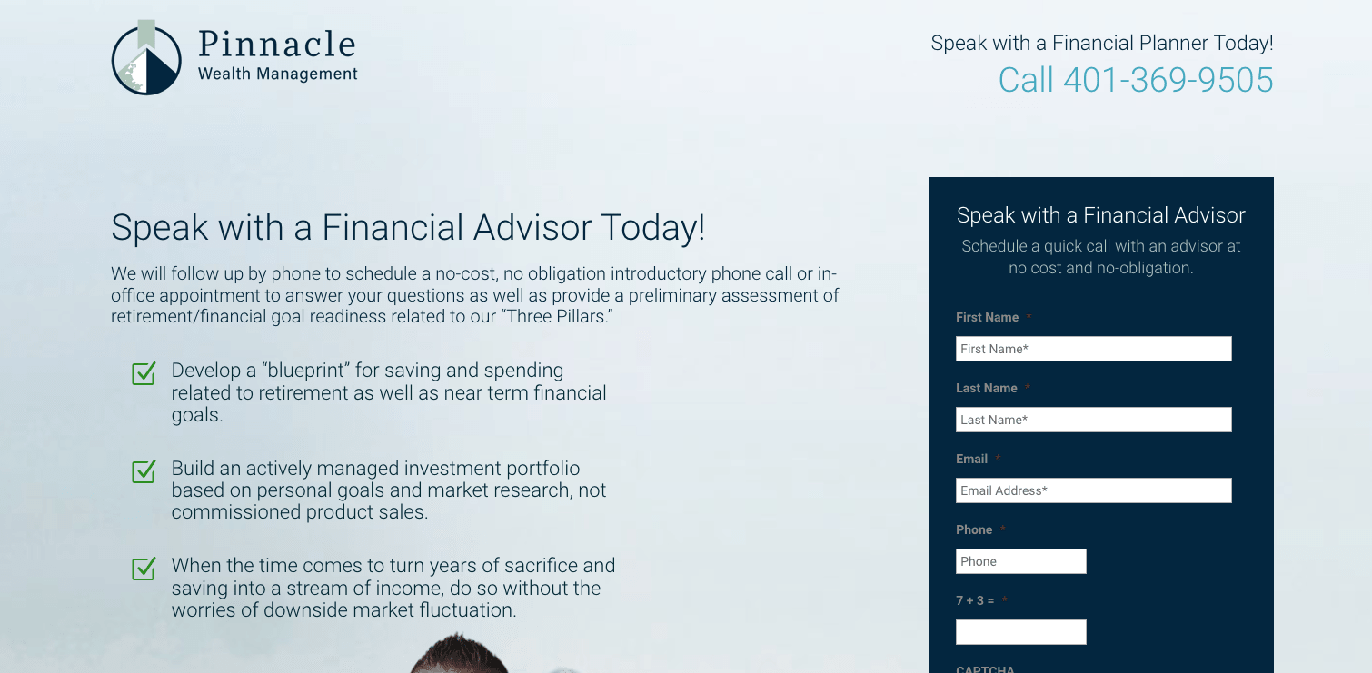 Pinnacle Wealth Management Landing Page
Big, Bold Lead Capture Forms
Most landing pages have one primary call to action: to fill out a form.
For optimal lead generation, put this lead form above the fold and display it prominently. (Some landing pages keep the form stationary, even when users scroll down the page.)
If your users have only one option – to fill out the form – then guess what? More of your users will fill out the form.
The rule of thumb is: include the minimum number of fields necessary to qualify your leads, and no more. Each additional field will decrease conversion. Sometimes you may decide to ask more information up front to better qualify sales leads, but if in doubt, leave a field out.
Asking for more information in your lead form is a question of quantity vs. quality. Would you rather have more leads that are less qualified, or fewer fields that are more qualified? (Your sales team will always complain about the quality of your leads, but not having enough quantity is a much bigger problem.)
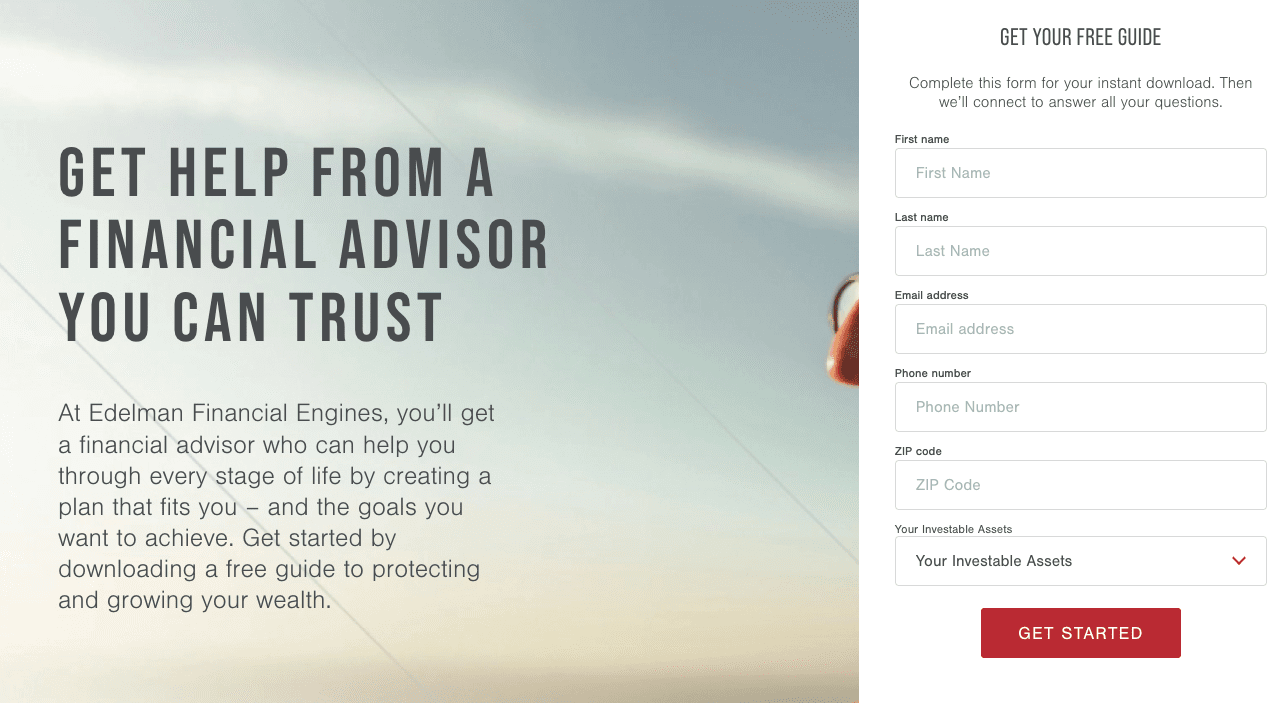
Edelman Financial Engines, a financial services provider, pushes landing pages with clean, informative, and (most importantly) conversion-driven pages. They use the offer of a free guide along with a straightforward form. Note the form asks a critical piece of qualifying information – investable assets – by using a simple dropdown menu (much easier for users than an empty text box).
Responsivity
Ensure your landing page is fully responsive across all devices, meaning it loads quickly and looks good on mobile, tablets, and desktops. Why this matters: according Niel Patel, 73% of users reported encountering mobile sites that don’t load quickly or properly–and 49% will only wait 15 seconds or less before bouncing.
To minimize distractions and ensure your page visitors stay focused on conversion, consider keeping menus and navigation links off your landing page. This will streamline the user experience and prevent visitors from leaving your page before they fill out your form.
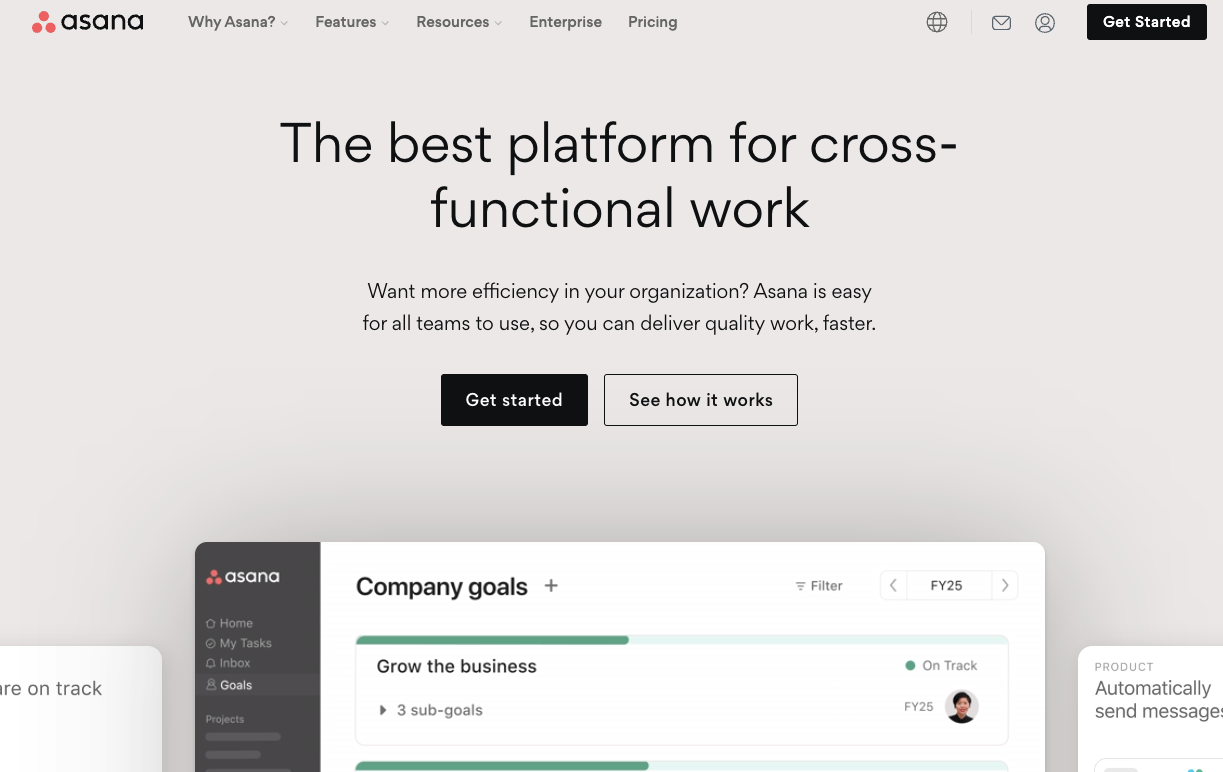
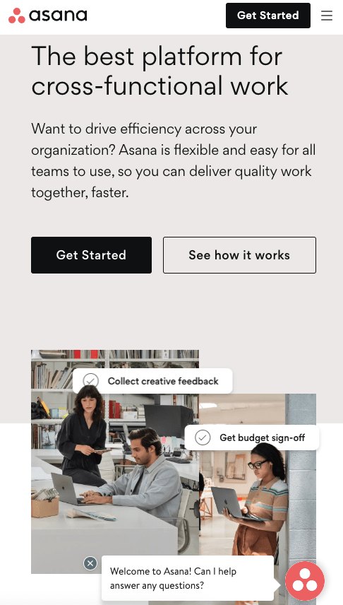
Asana does responsiveness well. The desktop version of this landing page includes an above-the-fold CTA and animated demonstrations of their product. The mobile version maintains that CTA and collapses the larger animations into smaller but attractive imagery.
Landing Page Metrics: What to Track
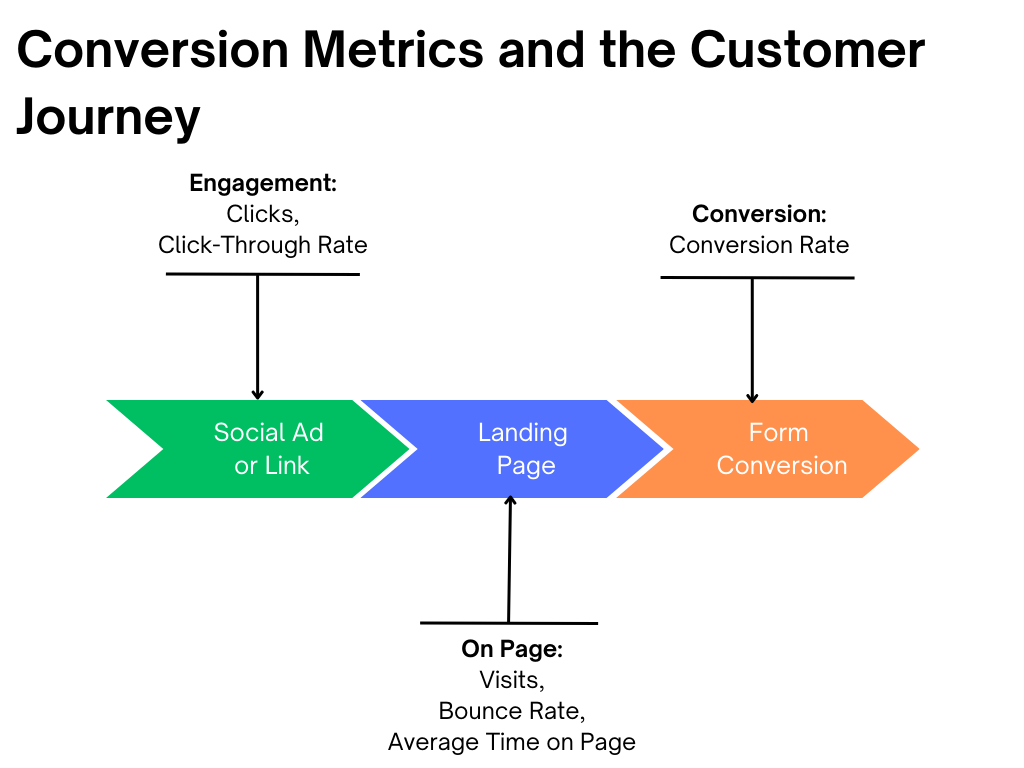
Measuring and analyzing your landing pages’ performance is critical to ensure you’re getting results.Here are the big metrics you should watch:
- Click-through rates: A “pre-landing page” measure, your CTR shows how many people saw the ad or link, vs. how many clicked through to your landing page. This indicates the effectiveness of your ad or link.
- Visits: Tracking the total number of visits to your landing page will give you an overview of the page’s overall popularity.
- Bounce rates/Average time on page: A bounce rate is how many users “bounce” off your landing page without interacting. (Lower = better.) Conversely, average time on page (a newer analytic supported by Google) shows how long a user stays on the page. (Higher = better.)
- Conversion rates: This is the big one, as it quantifies the percentage of visitors to your page who take the desired action, such as filling out your lead form.
Improving with A/B Testing
Also sometimes called split testing, A/B testing is a way to improve the performance of your landing page. It involves creating two versions of one page (version A and version B) with a single differing element, such as a headline or CTA. By comparing the performance of the two versions, you can identify which element resonates better with your audience.
Need convincing to try A/B testing? According to Startup Bonsai, some 60% of businesses call it “highly valuable” for bolstering conversions.
Good Landing Pages Are Growth Engines
For marketers, landing pages are the engines that drive conversions. When you optimize these engines for high performance, it fuels your entire sales funnel – and ultimately helps your business accelerate.
By building better landing pages with the right content, images, and lead-generating forms, you can build a better business – and become the lead-generating marketing manager that everyone loves.
________________
Let us help you connect with your audience and make your landing pages work for you. Take Media Shower for a test drive today.
