Quick Summary
- Vietnam-era protest signs prioritized moral clarity over cleverness.
- Modern protest signs balance physical visibility with social media virality.
- Core principles haven’t changed.
- Speed and reach have transformed dramatically.
- The principles of effective protest signs translate directly to marketing.
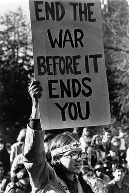
1967: A weathered hand holds a stark black-and-white sign reading “STOP THE BOMBING” during a Vietnam War protest.
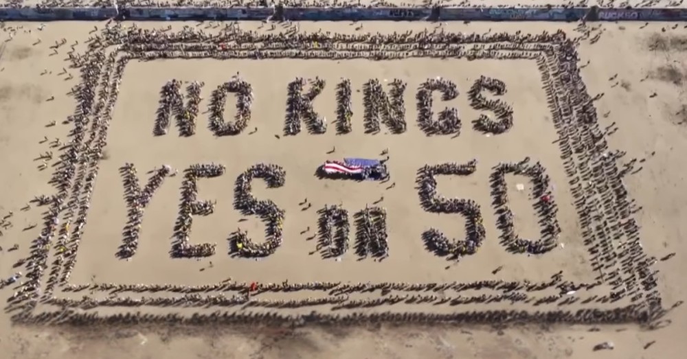
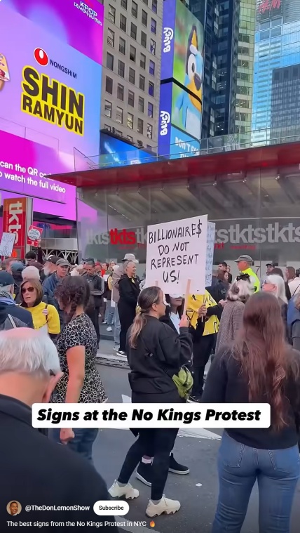
2025: Crowds flood streets across America, brandishing “NO KINGS” banners and signs featuring everything from bold typography to inflatable frog costumes.
What connects these moments separated by nearly six decades? And what can content creators and marketers learn from the enduring power of protest signage?
The answer lies in a fundamental truth about communication: Clarity wins. Whether carved into history or trending on social media today, the most effective messages share common principles: brevity, visual impact, emotional resonance, and instant comprehensibility.
For marketing professionals competing in an increasingly crowded attention economy, a look at protest signs old and new offers a masterclass in how to cut through noise.
Vietnam War Protests: Moral Clarity
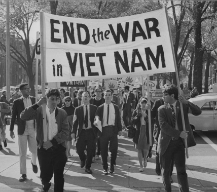
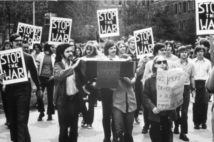
The anti-Vietnam War movement grew gradually in the mid-1960s before exploding into massive demonstrations by 1968. As protests scaled, organizers recognized that visual messaging required just as much strategy as speeches and chants.
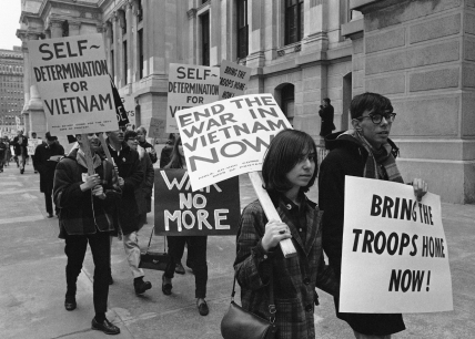
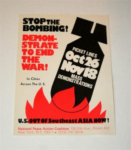
Typical slogans prioritized moral clarity over cleverness: “STOP THE BOMBING,” “Children Are Not Born to Burn,” “End the War NOW.” They were urgent declarations designed for maximum impact.
During the height of the Vietnam War protests, signage was built for one goal: be seen and understood in a march.
What made Vietnam-era signage work
- Bold uppercase typography. Nearly every sign featured stark, hand-painted capital letters readable from blocks away. The lettering style often came from professional sign painters or church print shops that produced runs of 400+ identical posters.
- Minimal text. Most signs contained five to seven words maximum. Protesters understood that passersby—whether on foot or watching broadcast news—had seconds to absorb the message.
- Strong moral claims. Vietnam-era signage didn’t rely on humor or wordplay. Messages made direct ethical appeals: children shouldn’t burn, bombing must stop, the war is destroying lives.
- Intersectional messaging. Many signs connected the war to domestic issues of race and class, broadening the coalition and deepening the critique.
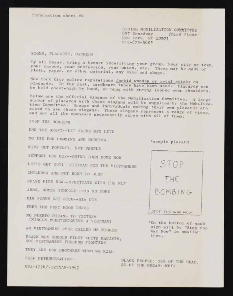
- Coordinated efforts. Organizers produced guidance documents for volunteers along with suggested slogans.
When every word counts, brevity plus moral clarity equals visual impact. The signs that endured in historical memory are those that distilled complex geopolitical situations into human-scale truths anyone could grasp instantly.
No Kings Protests: Creativity + Shareability
More than 50 years later, the “No Kings” movement represents protest signage’s modern evolution. Demonstrations held on June 14 and October 18, 2025, drew millions across the United States and internationally, with organizers estimating over 2,700 events across all 50 states.
Unlike the centrally coordinated messaging of some historical movements, No Kings protests featured diverse visual approaches—from professionally printed vinyl banners to hand-scrawled cardboard to digital templates optimized for social sharing.
Sentiment in these protests was very different from the message of the ‘70s. Many protesters chose whimsy and humor as a deliberate way to show that the demonstrations were peaceful when some media outlets were portraying them as violent and hate-filled.
The blend of creativity and shareability creates sign visibility beyond physical presence. In 2025, a protest sign’s life extends far past the march; it becomes a meme, a profile picture, a rallying symbol that spreads organically through digital networks.
What hasn’t changed
Despite transformed media landscapes, the fundamental purpose remains identical: communicating a message with maximum visibility and clarity. Whether photographed by a 1968 wire service journalist or a 2025 smartphone user, effective signs share core principles:
- Readability at a glance: You have seconds to communicate.
- Emotional resonance: Connecting to shared values or experiences.
- Visual contrast: Standing out in crowded environments.
- Memorable language: Phrases that stick in minds and spread through conversation.
What has changed
The mechanics of distribution and audience expectations have transformed completely.
- Speed and reach. A powerful 1968 sign might appear in the next day’s newspaper, reaching thousands. A 2025 sign can reach millions within an hour through Twitter, Instagram, and TikTok.
- Audience expectations. Modern audiences encounter hundreds of messages daily, raising the bar for creativity and originality.
- Dual functionality. Today’s signs must work both physically (readable from 50 feet) and digitally (compelling in a 2-inch smartphone screen).
- Strategic diversity. Rather than unified visual messaging, successful modern movements embrace diverse creative expressions that appeal to different audience segments while maintaining thematic consistency.

Typical sign messages in 2025 reflected both serious concerns and creative expression:
- Direct assertions: “No Kings, No Masters,” “Defend Democracy”
- Pop culture references: Signs featuring Bart Simpson, references to Star Wars and The Handmaid’s Tale
- Humor and irony: Clever wordplay designed to be photographed and shared
- Personal identity markers: “Teachers for Democracy,” “Veterans Against Authoritarianism”
- Professional design meets grassroots energy. Unlike the uniformly hand-painted signs of the 1960s, 2025 protests featured a mix: professionally printed banners with consistent branding, digital templates activists could customize and print at home, and traditional hand-made cardboard signs.
- Visual innovation: Portland, Oregon, protesters pioneered using inflatable costumes—frogs, dinosaurs, aliens, turkeys—during immigration protests, a tactic that spread nationwide by October.
A Comparative Analysis
The table below shows how protest signage has evolved while maintaining core principles.
What hasn’t changed
Whether photographed by a 1968 wire service journalist or a 2025 smartphone user, effective signs share core principles:
- Readability at a glance: You have seconds to communicate.
- Emotional resonance: Connecting to shared values or experiences.
- Visual contrast: Standing out in crowded environments.
- Memorable language: Phrases that stick in minds and spread through conversation.
The mode of delivery has shifted, but the communication principle remains: make one point, make it visible, and make it memorable.
What has changed
However, the mechanics of distribution and audience expectations have transformed completely.
- Speed and reach. A powerful 1968 sign might appear in the next day’s newspaper, reaching thousands. A 2025 sign can reach millions within an hour through Twitter, Instagram, and TikTok.
- Audience expectations. Modern audiences encounter hundreds of messages daily, raising the bar for creativity and originality.
- Dual functionality. Today’s signs must work both physically (readable from 50 feet) and digitally (compelling in a 2-inch smartphone screen).
- Strategic diversity. Rather than unified visual messaging, successful modern movements embrace diverse creative expressions that appeal to different audience segments while maintaining thematic consistency.
Communication Lessons from Protest Signs
1. Choose one bold assertion
Like effective signage, strong content focuses on a single, clear message. Protesters don’t list ten grievances on one poster—they pick the most important statement and make it unmissable.
Apply it: Before writing your next blog post or social media campaign, ask: What’s the ONE thing I want audiences to remember? Build everything around that core message.
2. Design for visibility
High contrast, minimal text, and legibility from a distance define effective protest signs. The best signs communicate their message in under three seconds.
Apply it: Test your marketing materials by viewing them at thumbnail size or from across the room. If the core message isn’t immediately clear, simplify. Use bold typography, high color contrast, and whitespace strategically.
3. Make it shareable
Even in-person protest signage now reaches primarily online audiences. The most effective 2025 signs were designed with both physical and digital visibility in mind: clever enough to photograph, clear enough to understand without context.
Apply it: Create content that audiences want to share. This doesn’t mean chasing virality; it means crafting messages that resonate enough that people naturally want to spread them.
Consider how your content appears when shared: Does the headline work standalone? Does the visual grab attention in a feed?
4. Use symbolic language and visual metaphors
Vietnam-era signage used powerful imagery: “Children Are Not Born to Burn” created an immediate emotional connection. Modern protests use “No Kings” as symbolic shorthand for complex concerns about authoritarianism.
Apply it: Find the symbolic language that captures your brand’s essence or campaign’s purpose. What’s the metaphor that makes abstract concepts tangible? What’s the shorthand that conveys your full message?
5. Maintain visual consistency
Successful movements use repeating motifs—colors, fonts, icons—that create instant recognition.
Apply it: Develop and maintain brand consistency across channels. Repetition builds recognition. Whether it’s a signature color palette, typography style, or visual approach, consistency helps audiences instantly identify your content in crowded spaces.
6. Tie to larger narratives while keeping pieces actionable
Protest signs succeed because they’re part of a movement: individual messages that contribute to collective understanding. Each sign must also stand alone and communicate clearly.
Apply it: Every piece of content should connect to your broader brand story while delivering standalone value. Don’t assume audiences have context. Make each article, post, or campaign comprehensible on its own terms while reinforcing your larger narrative.
7. Respect context and audience
Protest signage works because it resonates culturally and historically. Messages reference shared experiences, values, and knowledge. The “I AM A MAN” signs drew power from Ralph Ellison’s “Invisible Man” and decades of civil rights struggle.
Apply it: Test for relevance and resonance rather than being provocative for its own sake. Understand your audience’s context: their challenges, language, cultural references, and values. Effective communication meets audiences where they are, speaking their language while challenging them to grow.

Whatever the slogan, the principle is the same: Say one thing, say it boldly, and make sure it’s unforgettable.
Marketer Takeaways
- Distill your message ruthlessly. If you can’t communicate your core idea in 5-7 words, keep refining.
- Design for the glance, not the stare. Your audience won’t study your content, they’ll scan it.
- Test for shareability before launch. Ask: Would someone screenshot this? Would they send it to a friend?
- Embrace symbolic shorthand. Find the metaphor or phrase that captures your entire message.
- Build consistency while allowing creativity. Establish core visual elements (colors, fonts, style), then let your team or community interpret them creatively.
- Respect your audience’s context. The best communication feels both familiar and challenging.
- Measure reach beyond your owned channels. Your best content will spread organically. Design for that.
Media Shower’s AI marketing platform helps brands turn clarity into a creative weapon. Click here for a free trial.
