Quick Summary
- A silhouette with staying power. Absolut transformed its unusual bottle into a globally recognized brand symbol that appeared in over 1,500 print ads.
- The longest running campaign in vodka history. The Absolut Bottle campaign stretched across 25 years and defined visual branding for the spirits industry.
- Art-world credibility meets consumer reach. Collaborations with artists like Warhol, Haring, and Britto helped Absolut blend commercial marketing with fine art influence.
- Explosive sales growth. Absolut’s U.S. sales jumped from 10,000 cases in 1980 to over 4.5 million annually by 2000.
In a world of flashy liquor labels and loud celebrity endorsements, Absolut Vodka built its brand around an understated glass bottle and a consistent visual format.
The Absolut Bottle campaign launched in 1981 and quietly became one of the most successful and longest-running ad series in history. By sticking with a minimalist template and letting culture do the talking, Absolut experienced a 4000% increase in sales.
In the process, they created a marketing legacy that continues to influence brands today.
The Story of Absolut.
The Brand That Started with a Bottle
In the late 1970s, Swedish vodka brand Absolut was virtually unknown outside its homeland. Entering the competitive U.S. liquor market was like trying to join a party where Stolichnaya and the old-guard domestic brands had already claimed all the good seats.
Absolut didn’t try to outmuscle the competition—it brought its own vibe entirely.
Legend has it that distributor Lars Smith had discovered a vintage apothecary bottle in a Stockholm shop and saw something iconic in it. Rather than changing the antique design to match the American market, New York ad agency TBWA decided to run with it.
With that simple bottle, they created one of the world’s most recognized silhouettes.
The strategy began with a simple observation: While the liquor category focused on loud labels and backstory-heavy brands, Absolut had something unique in plain sight. The bottle was symmetrical, clean, and instantly recognizable.
With their decision not to cover the bottle with a label, they delivered one of the most distinctive visual identities ever created in advertising.
A Simple Template
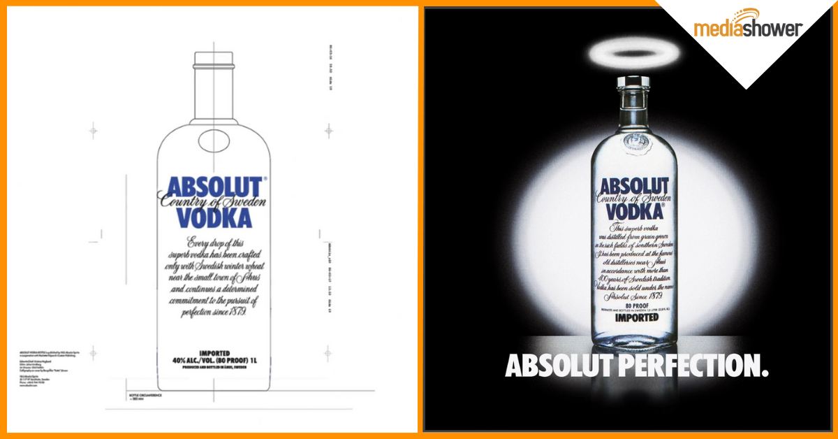
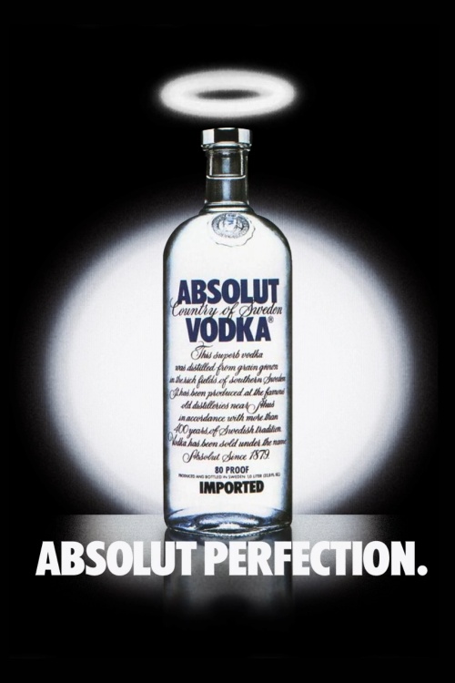
The first ad debuted in 1981. It featured a photo of the Absolut bottle with a halo hovering over it. The copy simply read: Absolut Perfection.
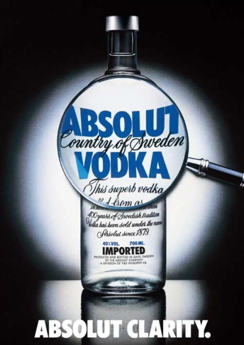
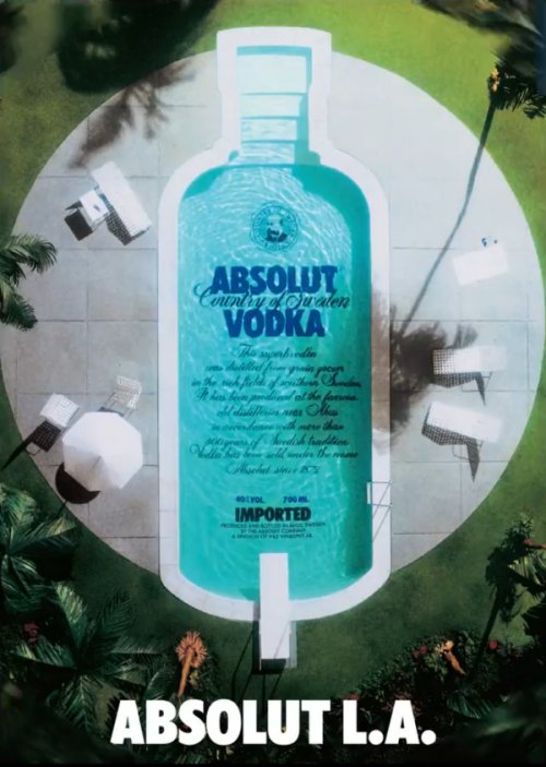
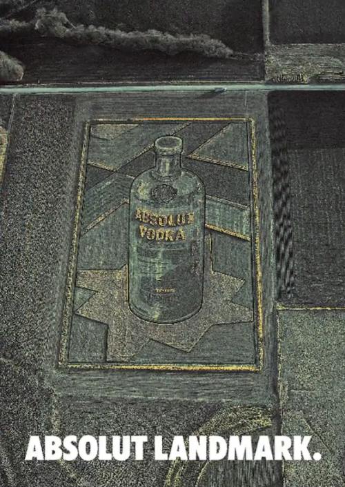
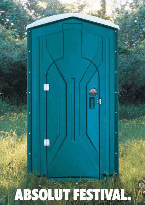
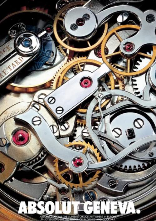
With those two words, Absolut launched the template that would remain consistent across the next 25 years: a stylized image of the bottle integrated into a themed setting, accompanied by a two-word headline starting with “Absolut.”
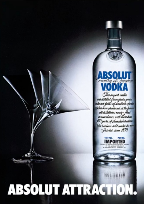
Each ad followed this formula. Over time, the bottle was illustrated as a city skyline, a fruit basket, a piano, and even a Christmas tree. The campaign featured images of American cities, then spread worldwide to cities like Geneva and Rome.
What began as a branding tool quickly became a canvas for cultural relevance. The brand crafted ads around holidays, professions, and pop culture phenomena.
The creative teams eventually produced more than 1,500 variations, always returning to the same core elements: bottle, visual pun, and two-word headline.
Cultural Phenomenon
The formula was consistent, but the impact was anything but predictable. As Absolut’s creative team pushed the boundaries of what could fit inside a bottle-shaped silhouette, something bigger happened.
The campaign stopped feeling like advertising and started feeling like art.
Absolut ads transformed into conversation starters, gallery pieces, and visual winks that tapped into the culture of the moment. Whether it was a nod to a city’s vibe, a clever take on holidays, or a tribute to underground subcultures, each ad placed Absolut at the center of a scene.
It wasn’t long before the bottle became a presence at gallery openings, fashion events, and nightclubs from New York to Stockholm.
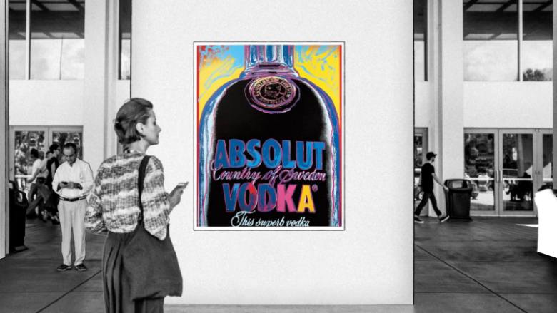
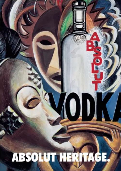
In 1986, Andy Warhol painted an Absolut bottle, initiating a series of collaborations with major contemporary artists including Keith Haring, Damien Hirst, and Romero Britto.
Absolut paid each artist to interpret the bottle in their own style. Their work was presented in gallery-like magazine placements, blurring the lines between advertisement and artwork.
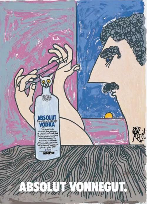
Through these collaborations, Absolut drew attention to challenging topics and ideas of the time, using art to change perspectives.
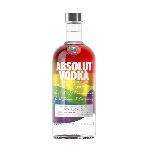
This positioning extended into social messaging. Absolut was one of the first major brands to advertise in LGBTQ+ media, running Absolut-themed visuals in The Advocate as early as 1981.
Why It Worked: Strategy Wrapped in Style
The bottle as the hero
Instead of using lifestyle imagery, Absolut centered its entire campaign on the product itself, making the packaging the message.
Consistent brand identity
Every ad used the same bottle shape and “Absolut [Something]” headline, building immediate visual recognition across decades.
Visual wit and endless creativity
Each version became a clever cultural reference—from Absolut Aspen to Absolut Disco—turning a fixed format into a flexible creative engine.
Early art-world partnerships
By commissioning big-name artists, Absolut aligned itself with high culture and earned credibility far beyond the package store.
Smart placement in premium media
The brand ran ads in high-end publications like GQ, Vanity Fair, and The New Yorker, reinforcing their upscale positioning.
Global adaptability
The simple bottle silhouette worked across languages and cultures, allowing Absolut to maintain a consistent identity while localizing for specific markets.
Ubiquity through variation
With more than 1,500 ads across multiple decades and media formats, the campaign was everywhere, but never felt repetitive.
Credibility through community support
As one of the first major brands to advertise in LGBTQ+ media, Absolut built trust and loyalty with communities that other marketers ignored.
Advertising as cultural commentary
While other brands were reflecting trends, the Absolut campaign contributed to them, blending commercial goals with artistic expression.
Impact and Results
By the mid-1990s, Absolut was the top-selling imported vodka in the United States. They did it without changing the product, only the way it was presented.
Some standout stats:
- U.S. sales increased by 4000% (not a typo) from 1980 to 2000, growing from 10,000 cases to over 4.5 million cases annually.
- Beyond sales, the campaign transformed nightlife culture. For three decades, Absolut pushed boundaries, evolving from parties with an artistic edge to events created by the artists themselves.
- 75 countries adopted Absolut’s bottle-based advertising approach, customizing it for local cultures.
- The campaign grew to over 1,500 unique ads by the end of its run. The ads are still highly collectible on sites like eBay.
- In 1996, Richard W. Lewis published “Absolut Book: The Absolut Vodka Advertising Story,” a collector’s item that has become a New York Times bestseller.
Absolut Unique: Adapting for the 21st century.
Marketer Takeaways
- Stick to one big idea. You don’t need to reinvent the wheel with every ad. Absolut made the same bottle shape sing across decades.
- Let your product lead. Instead of hiding behind lifestyle fluff, let the product—and its unique features—take center stage.
- Collaborate with cultural leaders. Artists, musicians, and creators bring fresh perspectives and street-level credibility that traditional marketing can’t replicate.
- Own your weirdness. A pharmacy-style bottle could have been a liability. Absolut made it an asset—and a legend.
Media Shower’s AI marketing platform can help you turn the simplest ideas into works of art. Click here for a free trial.