Of course the importance of ranking high in web searches cannot be overstated, but what about aiming even higher? What about impressing each visitor to your site so much that they feel compelled to add your URL to their esteemed list of favorites? Of course earning a bookmark may be tougher for niche sites—I mean how often does someone need to check DeathClock.com?— but no matter how small your client base is, the potential is always there to become a valuable resource, trusted outlet, or an entertaining destination worth coming back to. 
1. Offer Quality Content
Here’s the no-brainer on the list for sure. A website without quality content is like that greasy spoon diner off the highway: you might get lucky with a hungry visitor once in a while, but no one’s making it their destination. Of course at Media Shower we know useful and entertaining content is the absolute best way to build long-lasting web traffic, SEO ranking, and sales, but it’s also the best way to earn a bookmark. Ready to let us create some for you?
2. Interact with Your Visitors
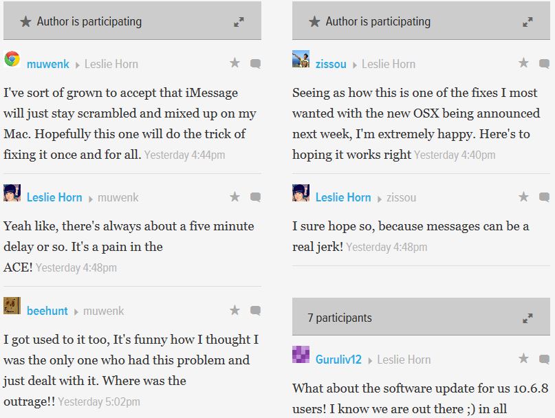
A site full of great content can always achieve favorite status, but when that content gets paired with top-notch interactivity, true web magic is made. Gizmodo, the popular design and technology site, offers heaping helpings of gadget news on a daily basis, but it also offers a forum for tech heads to talk shop. Of course each story has a comments section that is often filled with readers’ opinions, but the authors themselves also get involved in the discussion, as you see Leslie Horn doing above. A strong presence on social media sites is also a big part of the equation.
3. Take Blogging Seriously
Five years ago this tip might’ve said ‘Have a Blog’, but we’re past that now. These days it’s not enough to just have one, you also need to make sure it’s a living, breathing thing that gets updated frequently and doesn’t exist in some kind of public relations vacuum. Touch on topical events; take your readers’ temperature; use multiple writers. If your blog brings its A game, you’ll be giving visitors a one-two content punch that will certainly be rewarded with loyalty.
4. Be Pretty & Be Easy
Whether it’s in person or online, first impressions always count. When someone makes their initial landing on your site, you’d better believe they’re looking for a smooth experience. A user-friendly site that’s easy to navigate and attractive to the ol’ pupils, corneas, retinas, iri–OK, the eyes, the eyes are what we’re going for here– that’s ideal. We recently started using MailChimp to help us design and send our email newsletters, and we’re quite fond of it. The interface is simple and colorful, and there’s even subtle little links to funny stories or videos that they add to each page.
5. Show Some Personality
The MailChimp links are a great example of infusing your site with personality; they catch you off guard and remind you that behind this website, there’s an actual person with a sense of humor. You wouldn’t think a site that helps you design newsletters would be witty, but it is and it works. Ditching the dryness and writing your site in a personal style can strengthen the bond between your readers and your company.
Your site may not be destined to overthrow YouTube in terms of popularity, but armed with this advice, there’s no reason why it can’t soon be sitting side by side next to it on someone’s row of favorites. Good luck!

